UXGO Cohort 19
From East Coast to West Coast.
Over the course of this 10-week project, I had the opportunity to present our work at the CoCreate conference in San Francisco, in front of a live audience of 200 and over 1,100 virtual participants.
Watch the video below to hear me speak more about the project as I discuss it with my fellow team member.
Overview
When we think of the therapists and counsellors and practitioners around us, we often start the story by asking how they can help us.
As part of our work at soulside we had to start by asking a different question.
Who takes care of the caretaker?
The Problem
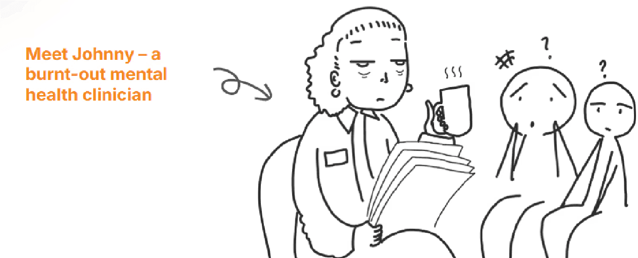
Caretakers are burned out.
Practitioners are buried under complexity, with patients and paperwork and invoices and insurance, they spend most of their time wading through quagmires before finally being able to provide the support someone so desperately needs.
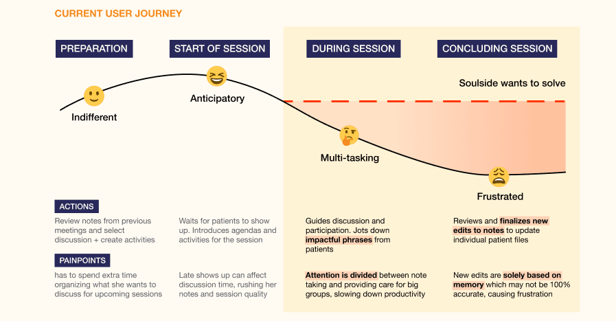
Soulside leverages AI and voice print technology to alleviate this administrative burden and provide practitioners more time to focus on what matters - their patients. So, where did we fit into this equation?
Secondary Research
When the Map is Missing.
When we began this project, we knew there was so much room for growth in Soulside and we were thrilled at the chance to offer it, but early on we were already staring down our first major hurdle… ambiguity.
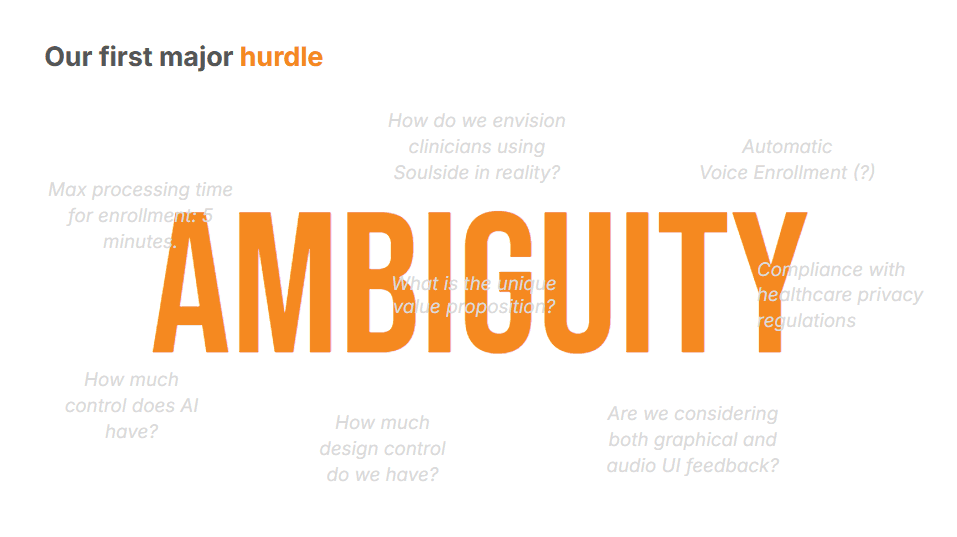
At the start of the project, scheduling hurdles made it tough to align on goals and get our questions answered about the project. Additionally, the product requirements document emphasized engineering success metrics, leaving our design impact unclear.
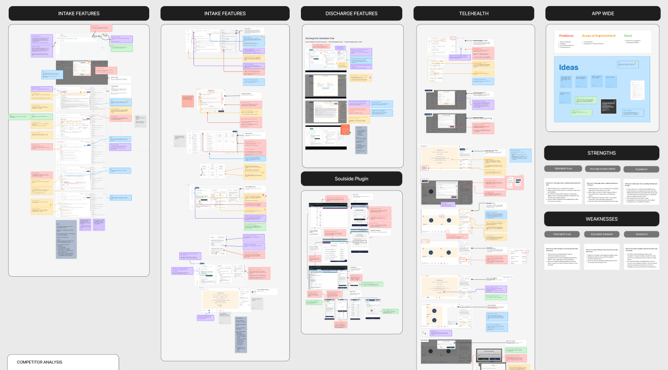
To navigate this, we took a step back and conducted a deep audit of the Soulside platform, diving deep into its structure and user experience.
We also ran usability tests, roleplaying as both therapist and patient to uncover what was working and where improvements were needed. This helped us map the user experience and understand the navigation road blockers we needed to fix.
Audit of Soulside Platform
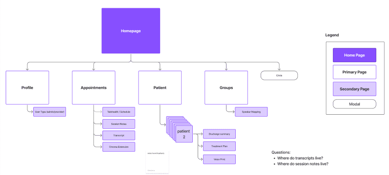
Site Mapping
Synthesizing Our Findings
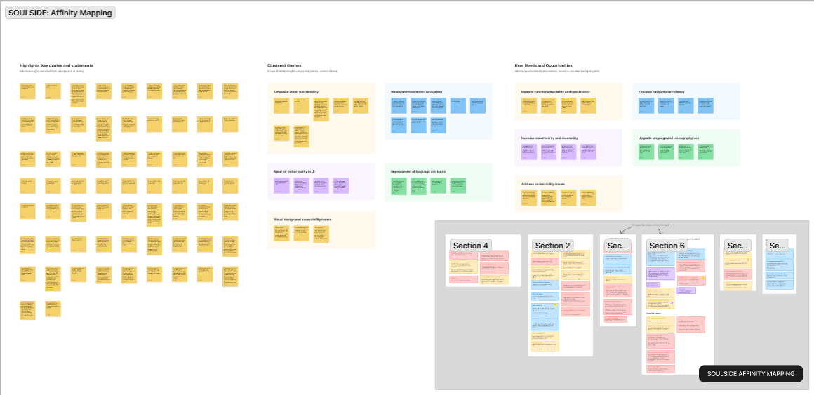
Through our audits, site mapping, and usability testing, we focused on what we could control.
We developed our own metrics and pinpointed three key areas for improvement: flow completion, drop-off rate, and mapping errors. This helped us refocus the project on actionable design improvements.
However, we soon faced another challenge...
User Research
Designing in the Dark.
Healthcare providers and practitioners are deeply private individuals. Their commitment to their patients is core to their ability to provide care, but that privacy made it incredibly difficult to source conversations and speak to the people who we were designing for.
Many of our cohort peers probably got a slack message asking if they knew anyone, because we had hit a wall with validating our findings with our users.
So what did we do? The short answer? Everything we could.
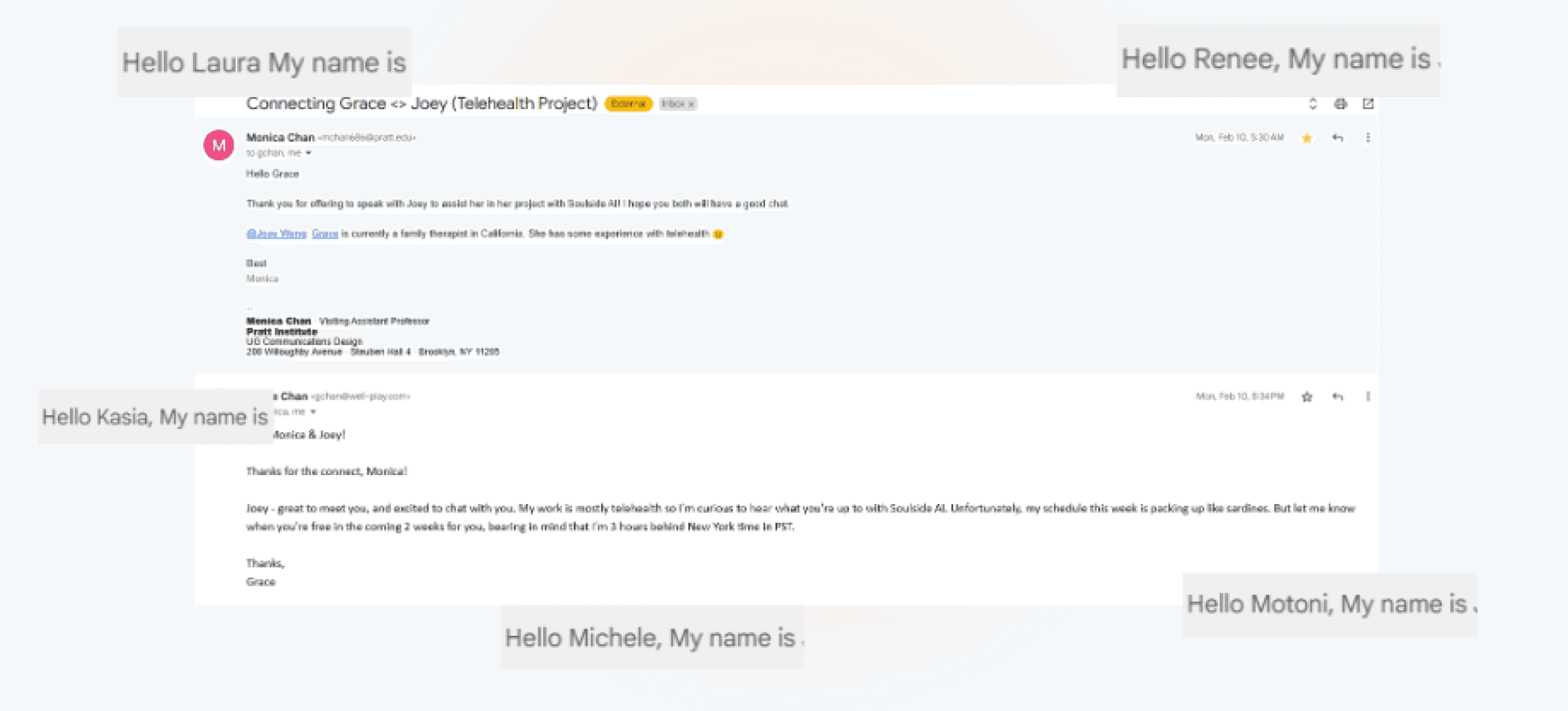
We didn’t have ideal users to test with, so we roped in every friend, family member, campus counsellor or private practice practitioner within speaking range, and focused their insights on what mattered most.
Our persistence paid off and we were able to conduct 10 user interviews with clinicians that gave us valuable data points, which we used as the foundation of our user personas and user journey mapping.
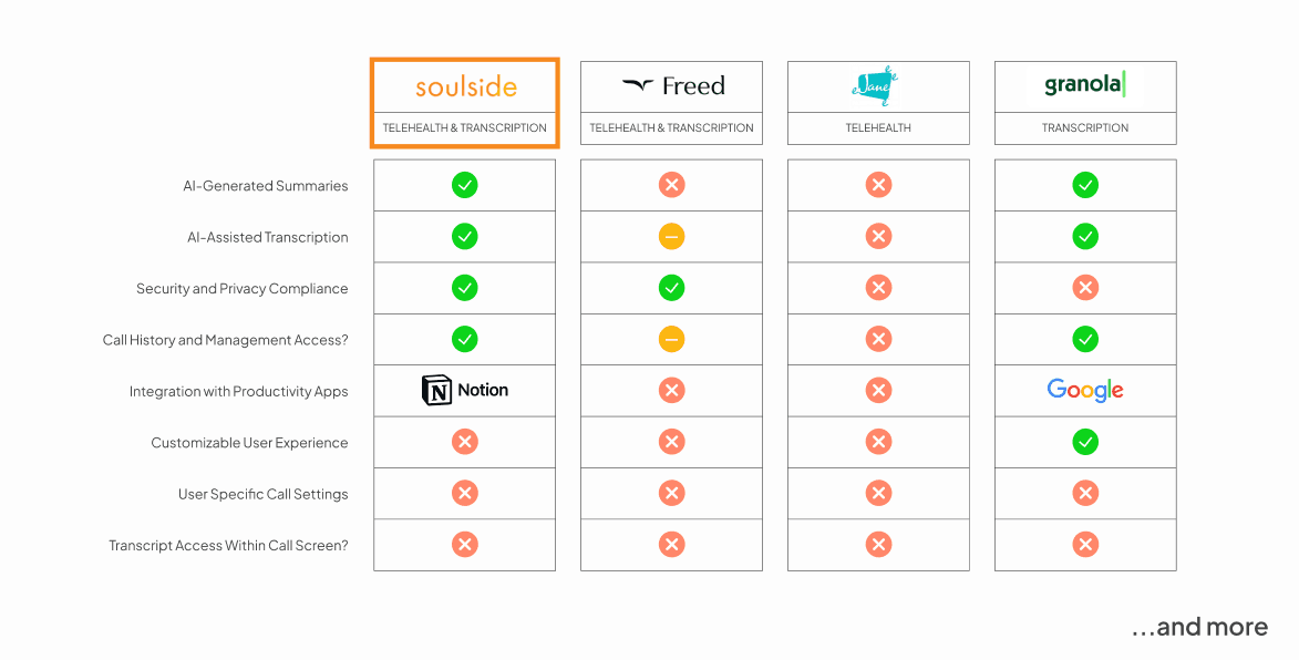
Additionally, we expanded our competitive audit to every app in the same ecosystem, and then beyond to anything that remotely shared a feature. Transcription, note taking, patient databases, telehealth and full blown EHR’s.
As we hit our stride we came to a realization…
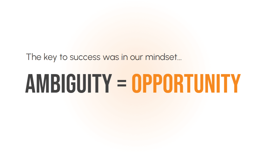
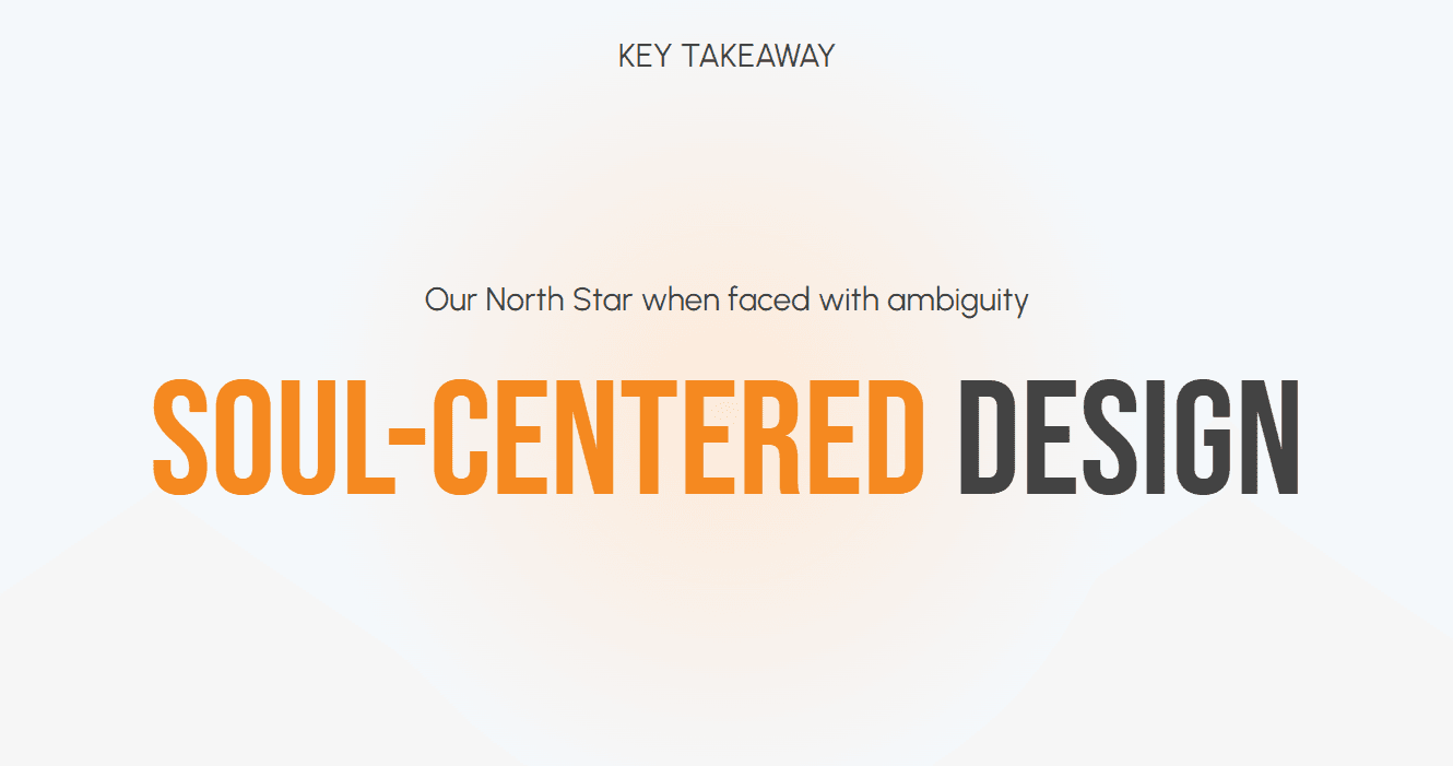
Ambiguity gave us an opportunity to be creative, to be empathetic, to be audacious but most of all, it was a chance to prove our own intuition.
Ideation
Putting Providers First.
After conducting user research to gain key insights, we focused on creating a solution of high value—one that was not only beautiful but also practical and reliable.
We involved our client in the process through ideation sessions, using techniques like crazy 8 sketches and wireframing to refine key features such as transcription and post-session navigation, ensuring the product would truly make an impact.
Crazy 8 Sketches
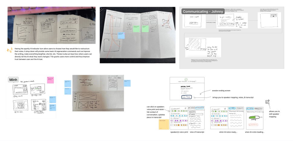
Wireframing
The Solution
Empowering Providers to Focus on Care.
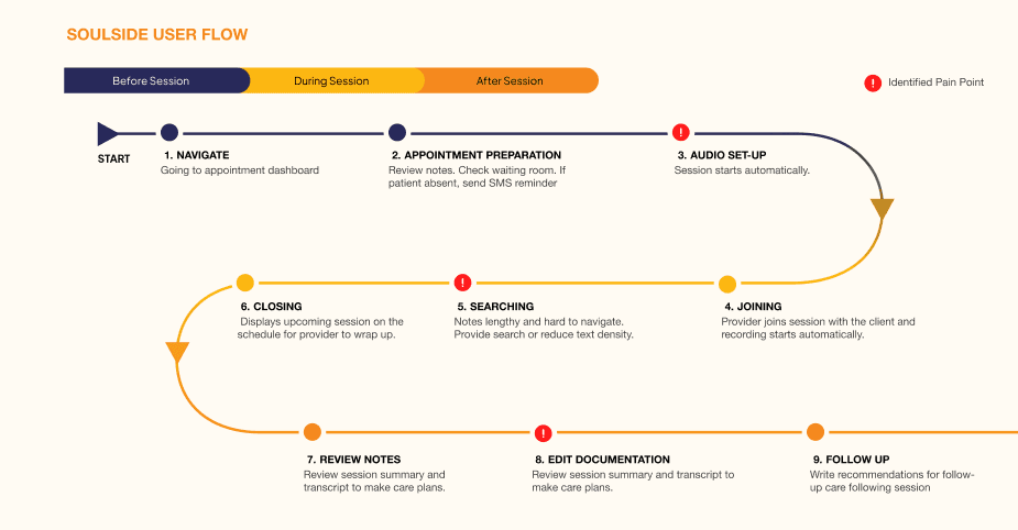
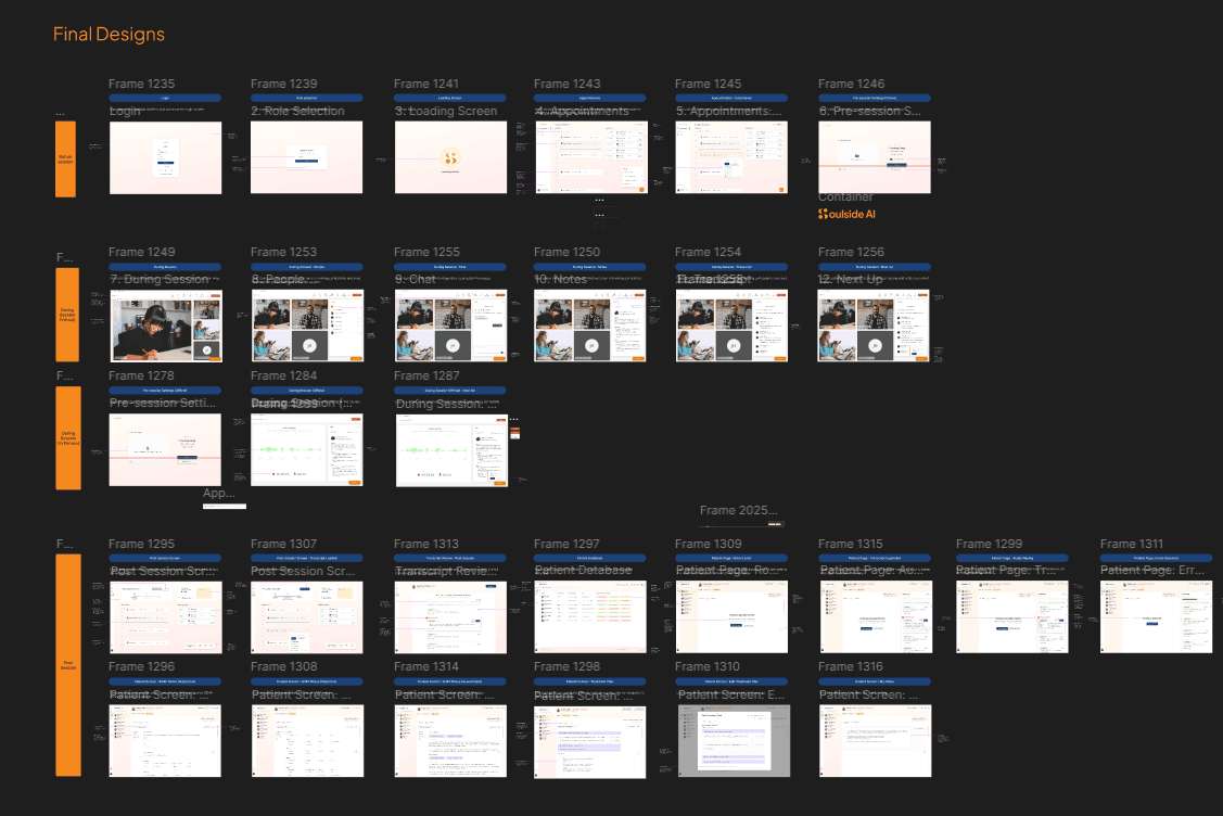
While we redesigned all the key screens within the app, we identified three critical user journeys where we could have the greatest impact and drive improvements in our design metrics.
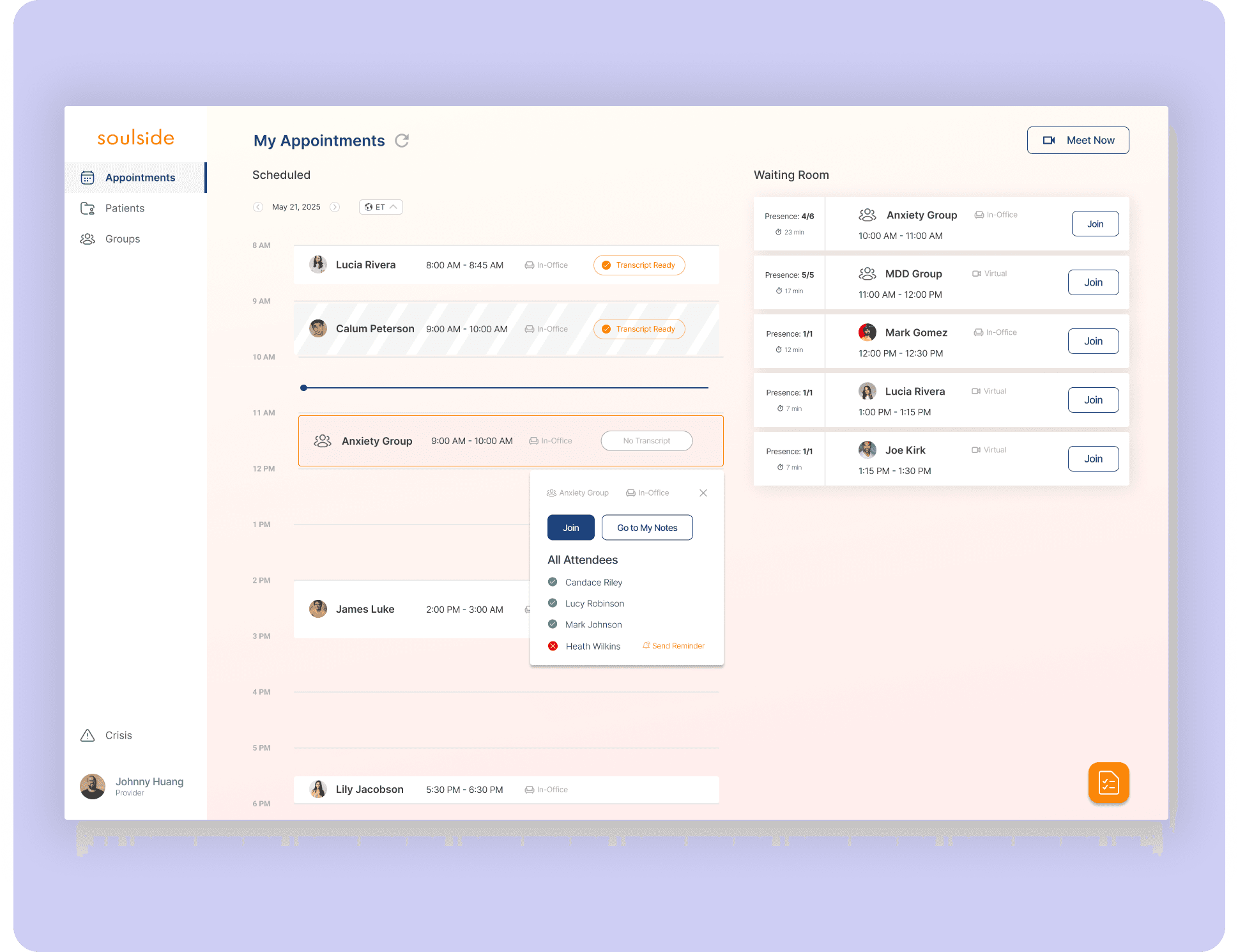
#1 Post Session Overview
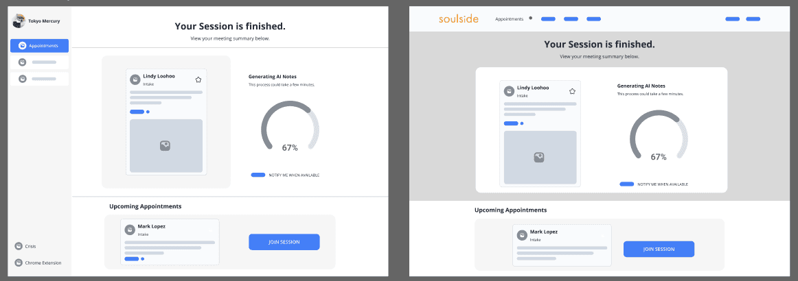
Before
Lack of Direction: After a session, providers are juggling thoughts like “Am I running late?” or “What’s next?” Soulside’s post-session screen wasn’t fully supporting them, missing an opportunity to offer clear direction and next steps.
After
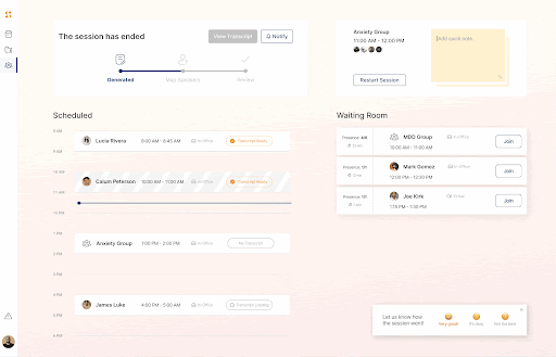
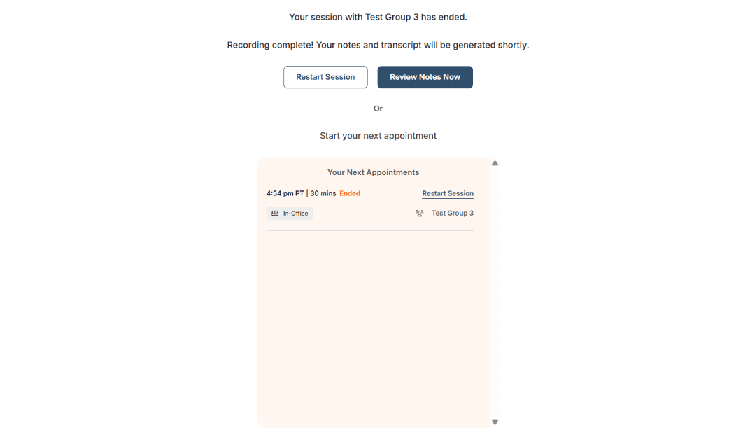
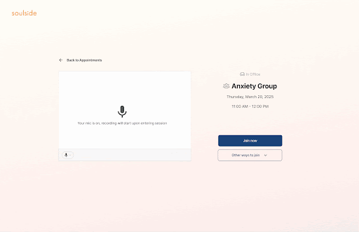
Post-Session Support: We improved the post-session experience with three updates: calendar visibility to keep providers oriented, a waiting room to manage ready patients, and a 'Quick Notes' section for capturing follow-ups on the fly.
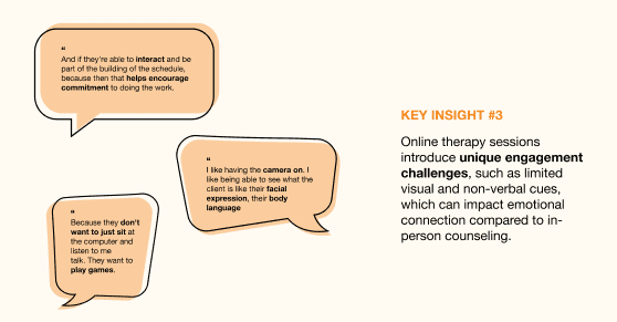
#2. Office Group Therapy Session
Before
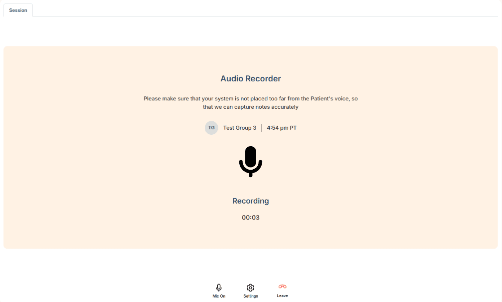
High Error & Drop Off Rates: We turned our focus to the in-person group therapy experience, where Soulside’s unique voice print mapping feature was critical—but underperforming. Users struggled due to a lack of guidance, leading to high error rates and frequent drop-offs.
After
Personally Supported: We introduced visual cues to show correct usage and warnings for errors, helping users adjust in real time. Onboarding and in-context tips were also added to ensure users clearly understood the feature and felt set up for success.
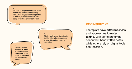
#3. Patient Notes & Transcription
Before
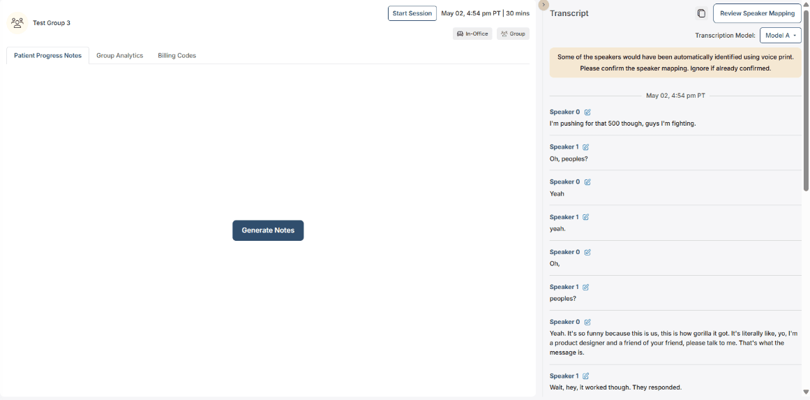
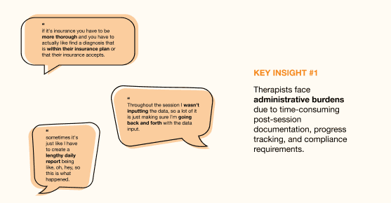
Lack of Visual Hierarchy and Clarity: Clinicians face heavy administrative demands, and while Soulside offers segmented notes and templates to help, the lack of visual hierarchy made it hard to navigate. As a result, providers spent too much time searching for information instead of using it efficiently.
After

Intuitive and Improved Navigability: We enhanced visual clarity and introduced clear information hierarchy, enabling providers to spot key details at a glance. Thoughtful labeling and grouping of notes also made navigation more intuitive and efficient.
Design Handoff
Preparing for Development & More.
In the beginning of this project, Soulside had no formal design system or guidelines. We put an immense amount of work into creating an entire design system from scratch.
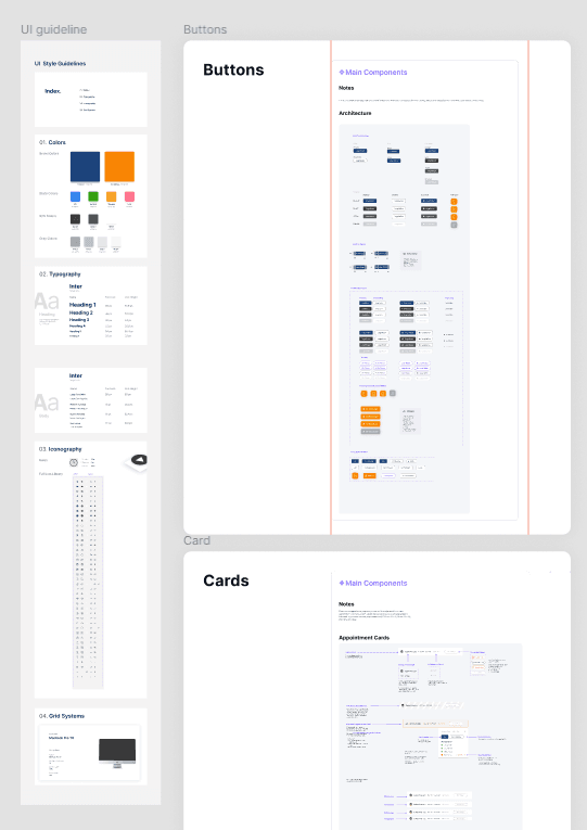
We also delivered a comprehensive handoff package to the client, including annotated designs, presentation decks, and all supporting research materials.
Product Demo
See Soulside in Action.
Below you can watch a video walkthrough of our platform in action!
The Outcome
A Different Telehealth Experience.
Our client was thrilled with the final product and is currently developing the implementation of our designs, with plans to ship them all soon.
I’m incredibly proud of our team—this project is a true testament to our passion for design and our commitment to creating people-centered experiences.